Why does software development start out fast, then slow to a crawl? Why does this happen faster when coding with a genie? What can we do about it?
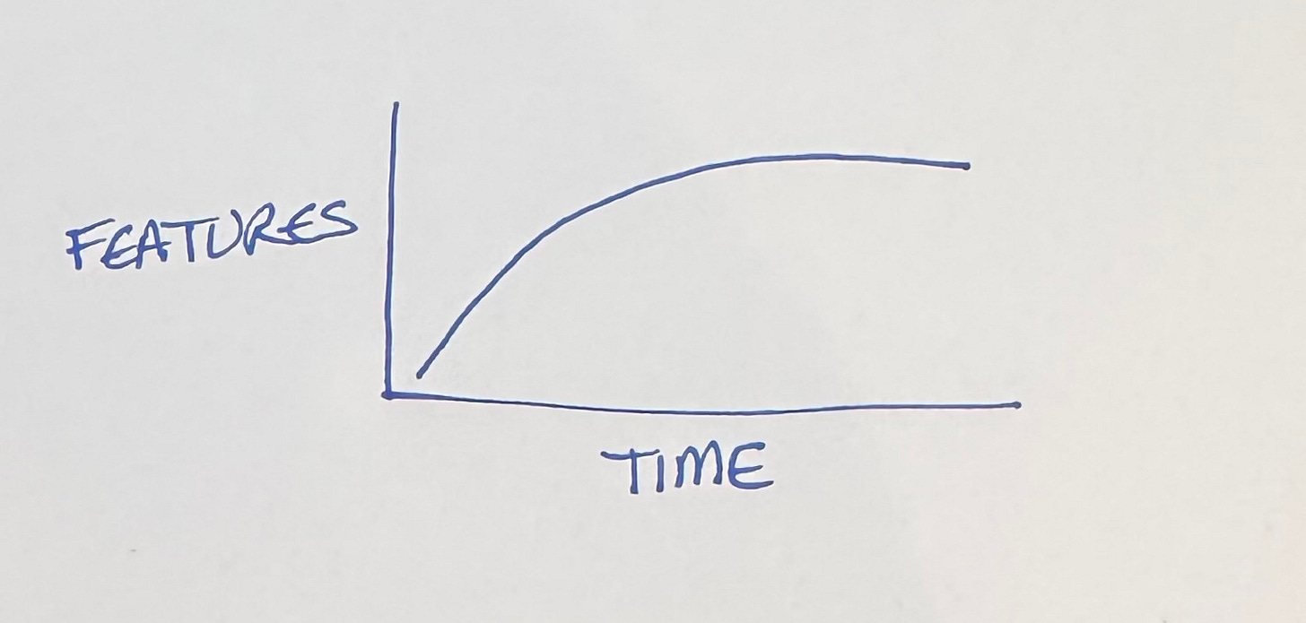
We’re going to play with graphs here for a second. The simplest way to look at our conundrum is to watch the features over time.
Rapid progress at first, then stagnation despite our best efforts. Bugs pile up. The build slows. Backwards compatibility imposes its own tax on progress. Original team members move on, while new members take time to acclimate.
What’s to be done? Is this just the price of progress?
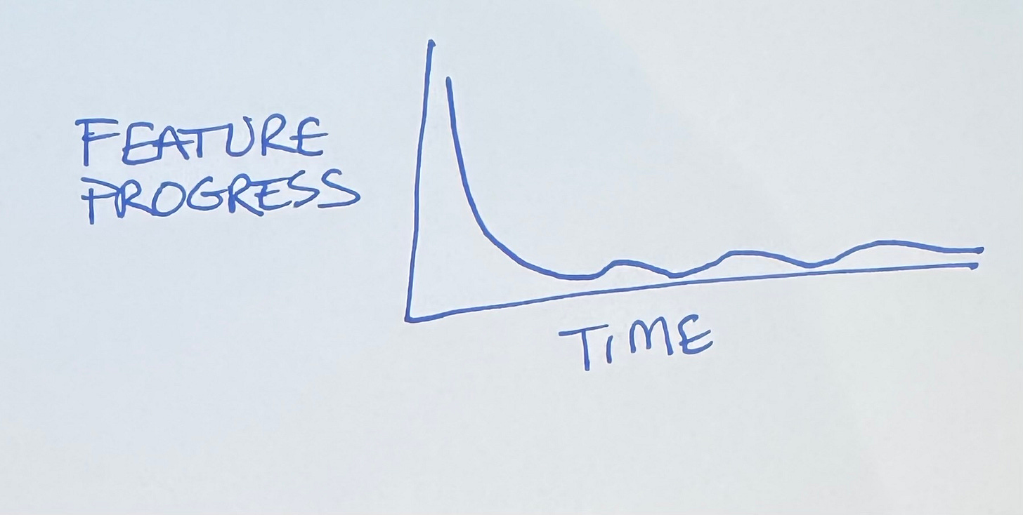
Let’s take the first derivative of features, feature progress over time.
Starts out gangbusters, then devolves to occasional bursts of productivity. We’re no closer to a diagnosis or a treatment. We just know that coding with a genie compresses time.
Scatterplot
The typical time series plot fails to generate understanding because it implies that the only source of change in the response is the unrelenting, impassionate drumbeat of time. Show cause. Show effect. — reader of Edward Tufte’s site.
Edward Tufte in Visual Display of Quantitative Information laments that most graphics are time series. If you want to understand the relationship between two variables, you need to plot them with each other, not just as part of the same timeline.
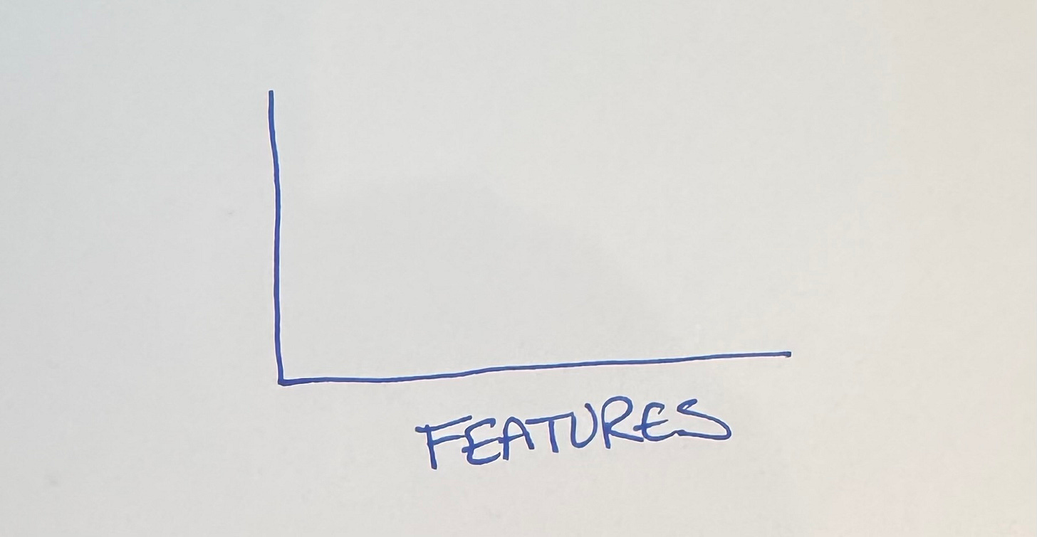
We want to understand feature development, so that needs to be one of the axes. I’m going to put it on the horizontal axis, for reasons that will become apparent (I tried it every which way before settling on this—I’m giving you the abridged version).
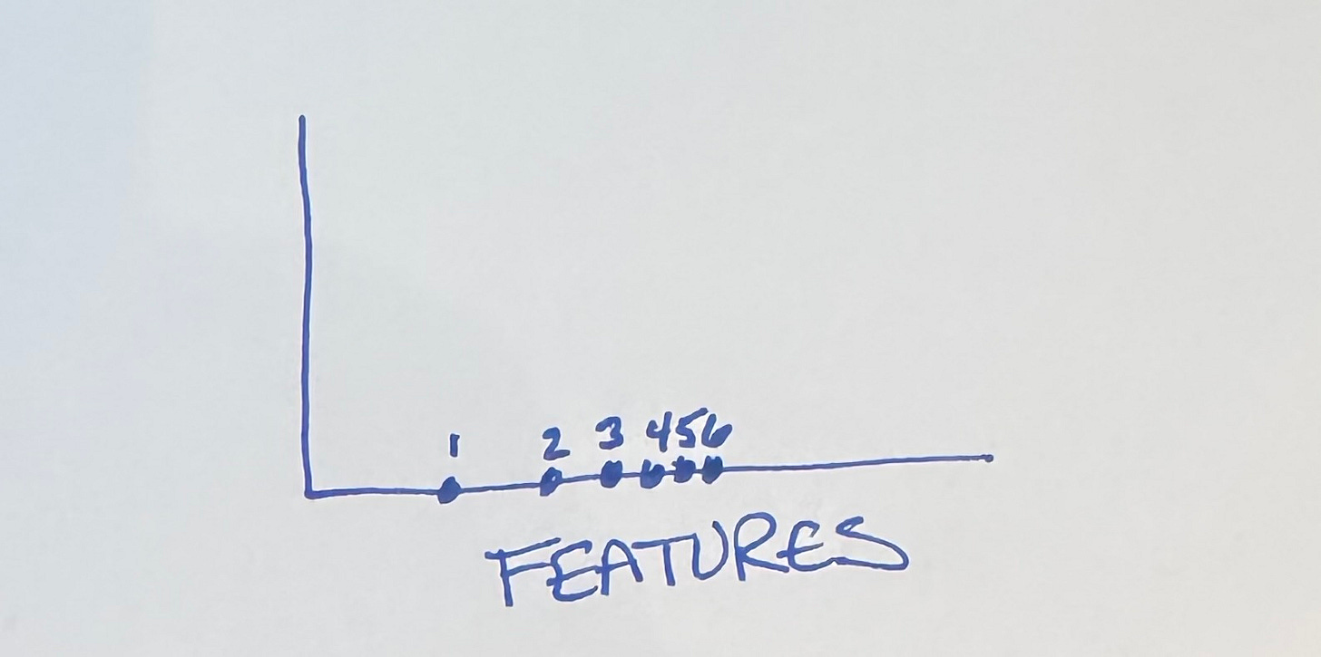
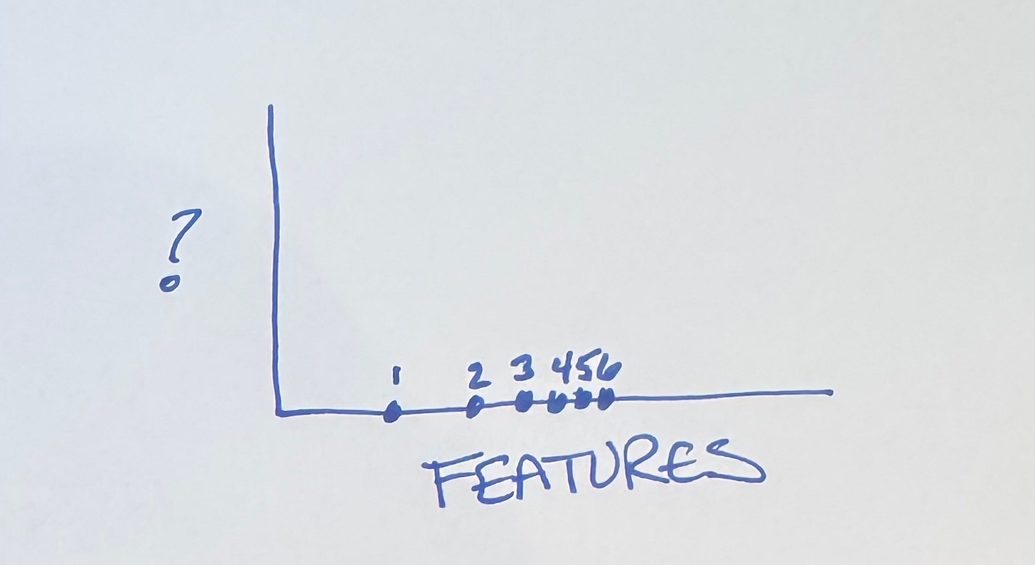
If all we’re looking at is feature progress, we expect progress to be spread apart (fast) at first, then bunch up as time passes.
But what goes on the vertical axis?
Options
No big surprise here, my fellow Tidiers. We know that software embeds economic value 2 ways:
Cash flow from current features
Optionality for future features
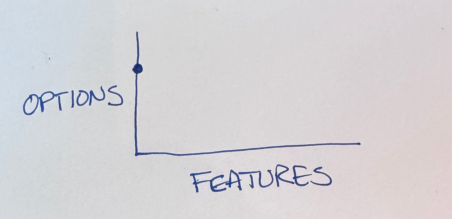
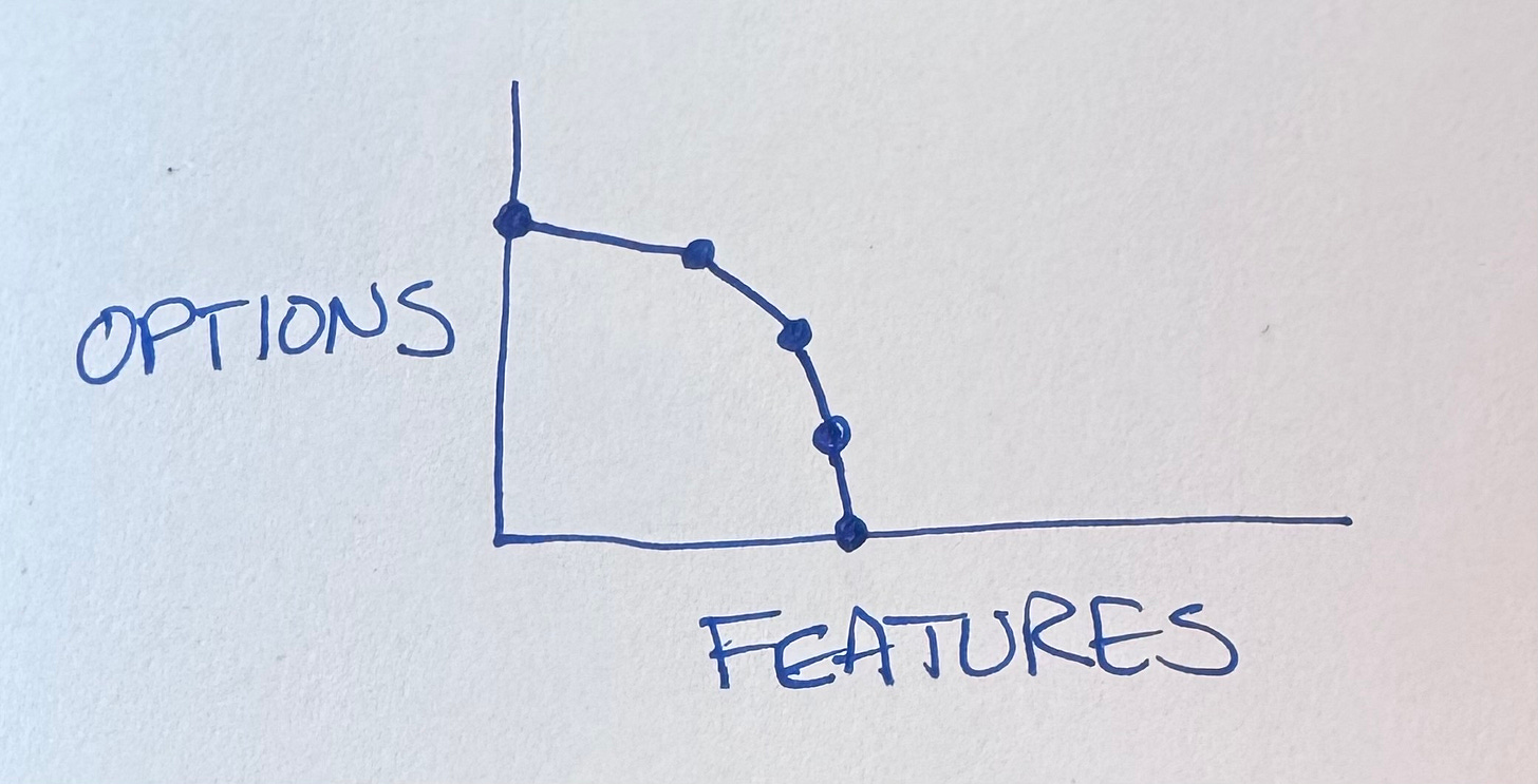
Let’s see how this plays out. We start out with no features & lots of options:
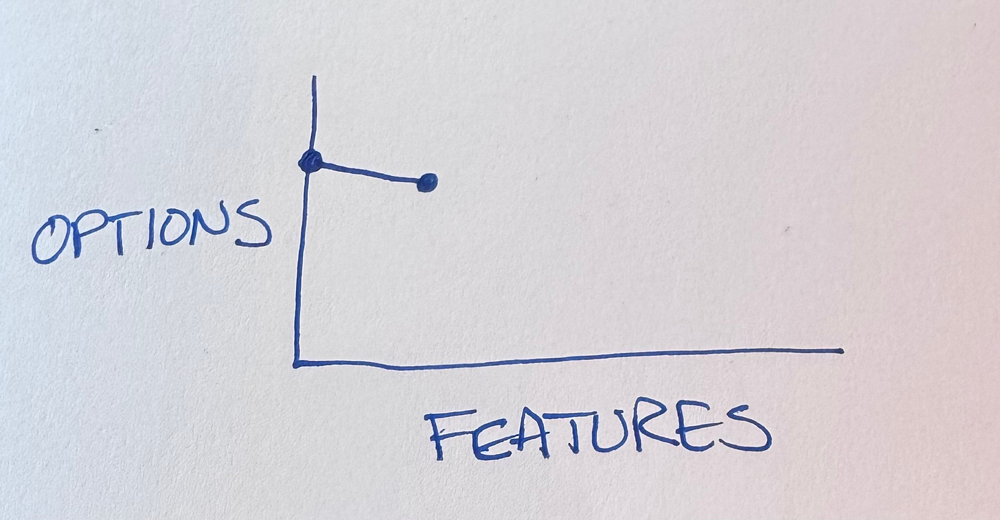
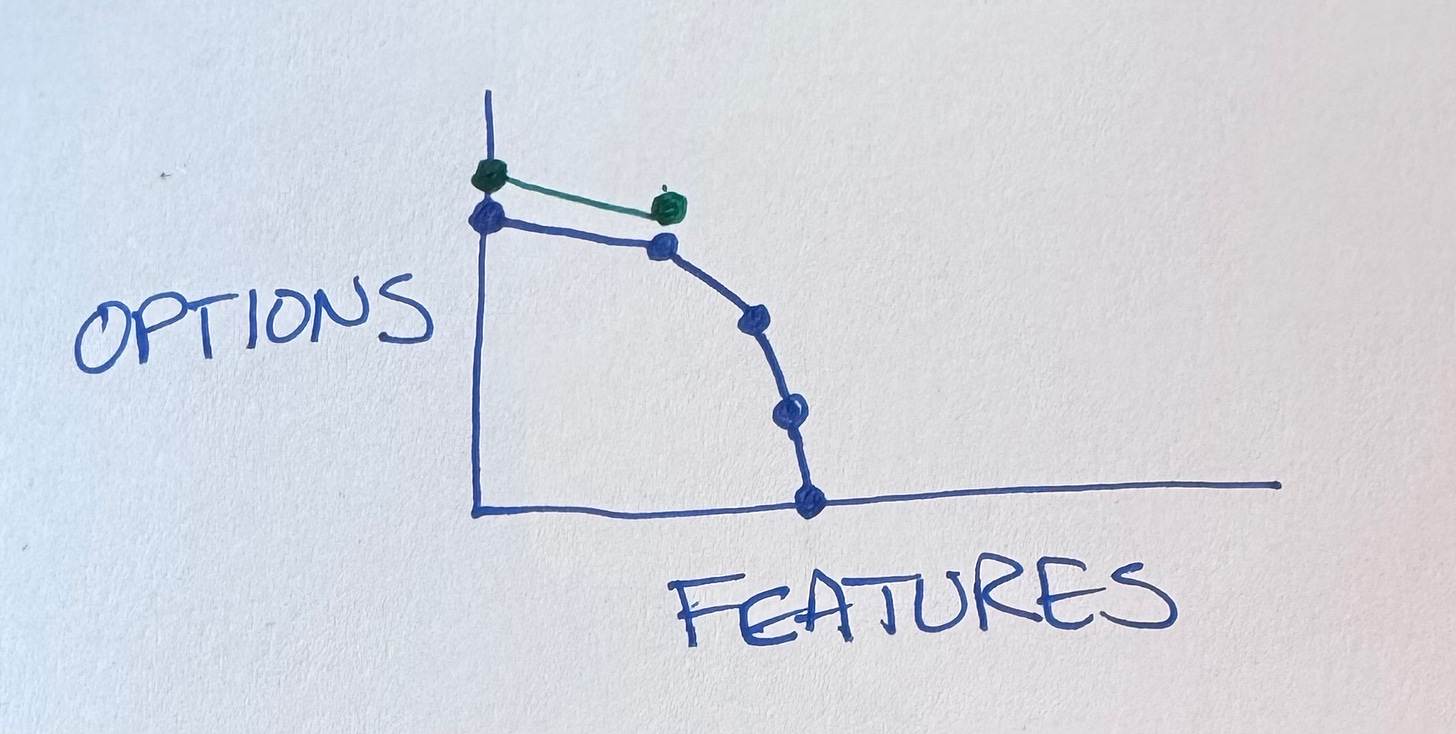
The first feature we develop goes pretty far but inevitably it burns options.
The code is now more complicated, we have to either preserve backwards compatibility or tear out the feature before proceeding.
(I hear the “why not make it better on both axes at once?” crowd. Make it run then make it right. My brain isn’t big enough to do a good job of both at once. Not even my augmented brain.)
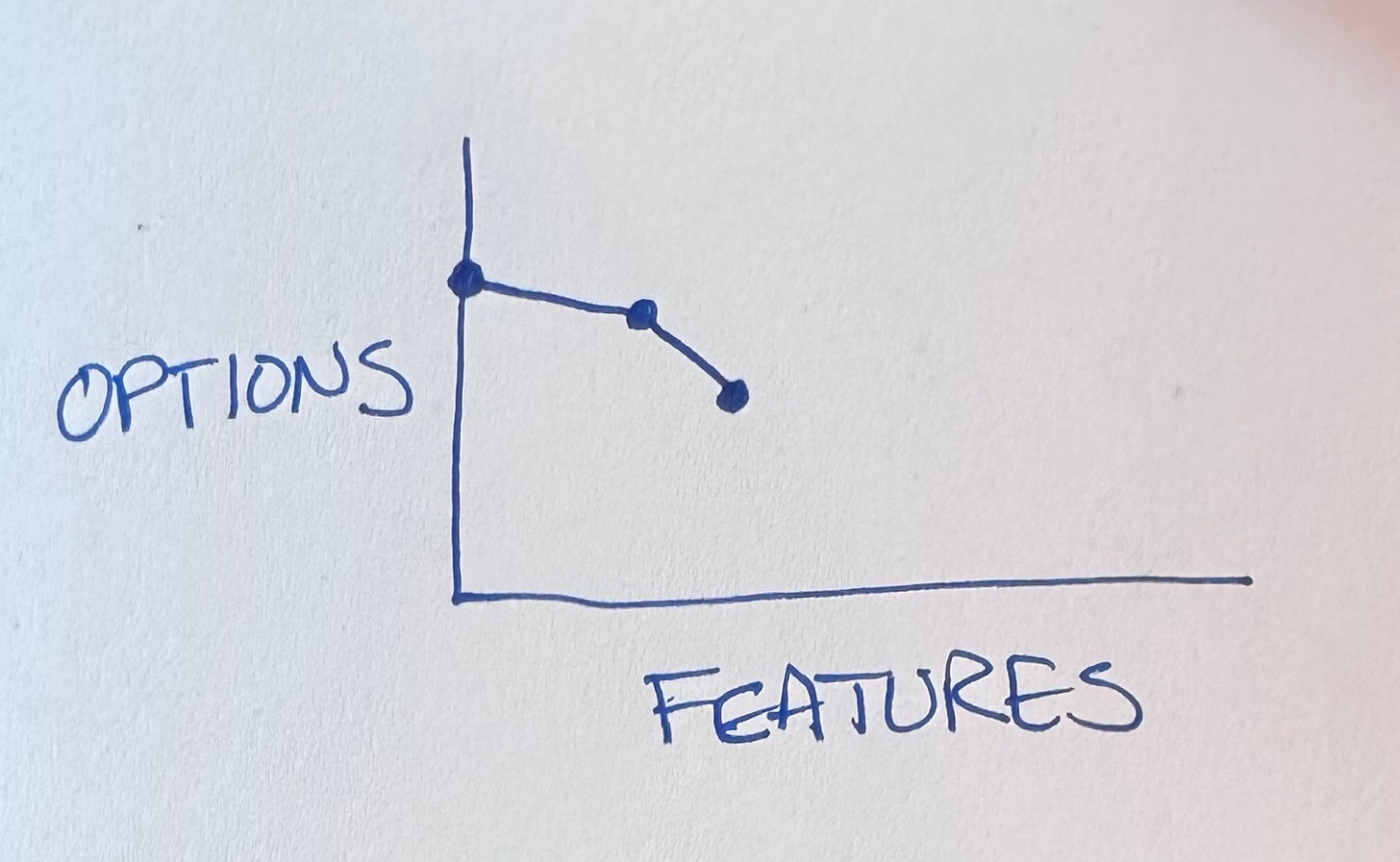
Okay, so we have one feature. We want more! Features feel good! Features make customers feel good!
It wasn’t much harder than that first feature. What’s that you say? More features & then more features? You got it!
You got it right until you don’t. If you look at my GitHub repos you’ll see BPlusTree, BPlusTree2, BPlusTree3, etc. In each case the genie & I drove the project out of options & had to start over. Somehow, though, I don’t learn my lesson. I don’t name the first project BPlusTree1—this time will be different!
Exhale Then Inhale
What’s the alternative? We can’t improve both axes at once. We can’t escape burning some options with each feature. The first feature is the same.
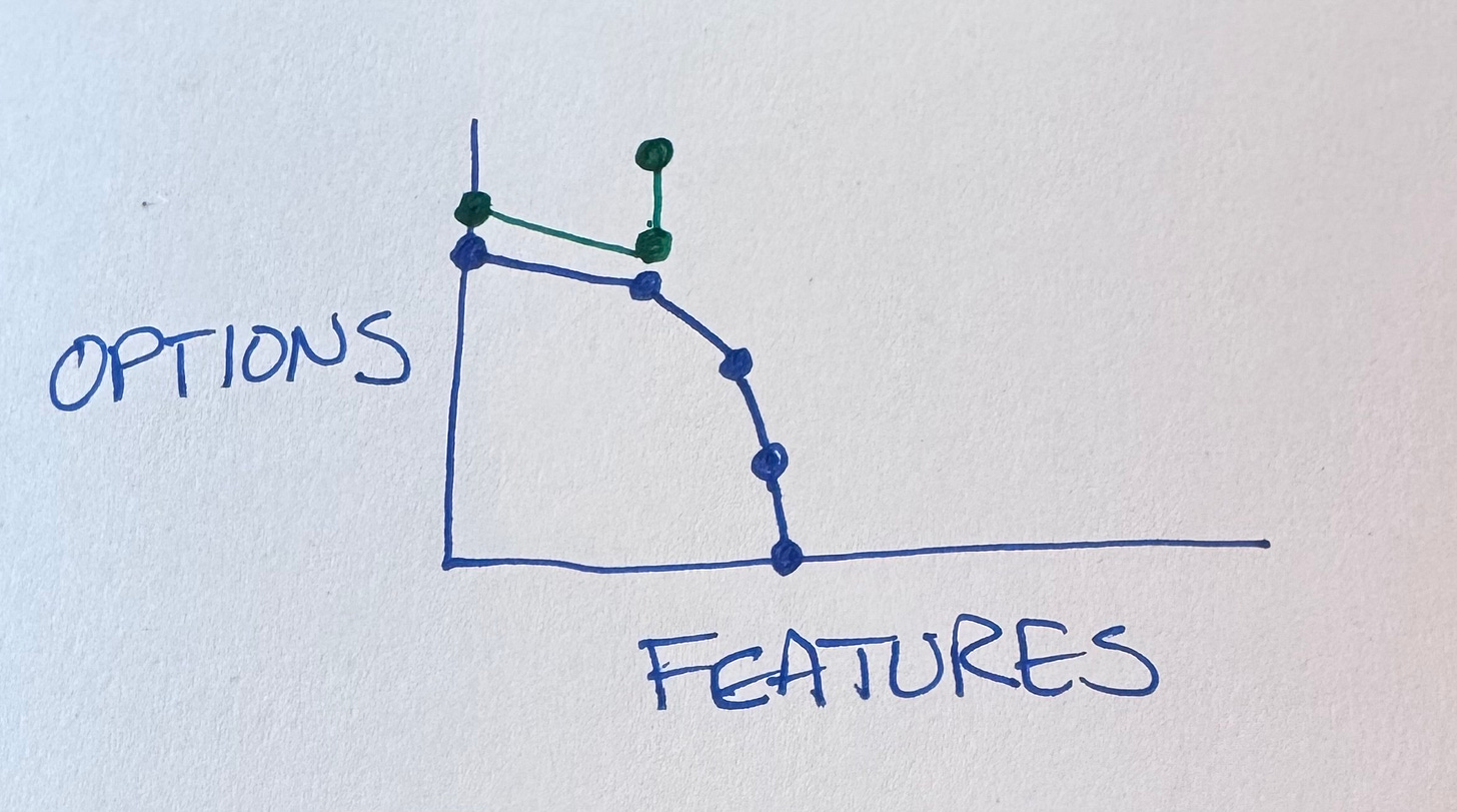
We do have a choice when we’ve finished that first feature, though. There is a space between features, should we choose to perceive it. In that space we can choose to invest in restoring & enhancing optionality.
Tidying first is one way to perceive this gap between features. What’s the next feature we are implementing? What about our current mess makes that harder? What can we tidy to make it easier? If implementing the feature is easier, then the option of implementing it becomes more attractive.
We can, should we so choose, continue this rhythm—feature, options, feature, options.
And Next…
That’s all I have time for today. I’ll use this same “Options Lead To Features” graph to describe a variety of problematic situations in development, augmented & not.
Thank you to Gene Kim for a long series of Tokyo breakfast conversations (long story) that helped refine this diagram.
Today’s post is sponsored by CodeRabbit. Boost your team’s code quality and shipping speed with CodeRabbit—the most advanced AI code review tool built for engineers. CodeRabbit delivers context-aware, line-by-line reviews, instant one-click fixes, and concise PR summaries, integrating right into your GitHub workflow so you spend less time diff diving and more time building.
What Makes CodeRabbit Different?
CodeRabbit provides AI-powered reviews that adapt to your team’s standards, enforcing style, spotting bugs and edge cases, and mapping out code dependencies automatically.
With multi-language support and over 40 linters and static analysis tools, it keeps your code clean, secure, and maintainable—no matter how complex your stack.
Real examples show dramatic impact: SalesRabbit cut bugs by 30% and boosted engineering velocity by 25% simply by adding CodeRabbit to all deploys.
Engineered to help junior and experienced devs alike, CodeRabbit catches issues even seasoned reviewers might miss, and its built-in documentation and reporting keep everyone informed and aligned.
Ready to optimize your engineering workflow?
Join thousands of developers who’ve halved code review time and defect rates with CodeRabbit. Start your 14-day free trial and experience seamless AI reviews, actionable feedback, and effortless codebase learning.

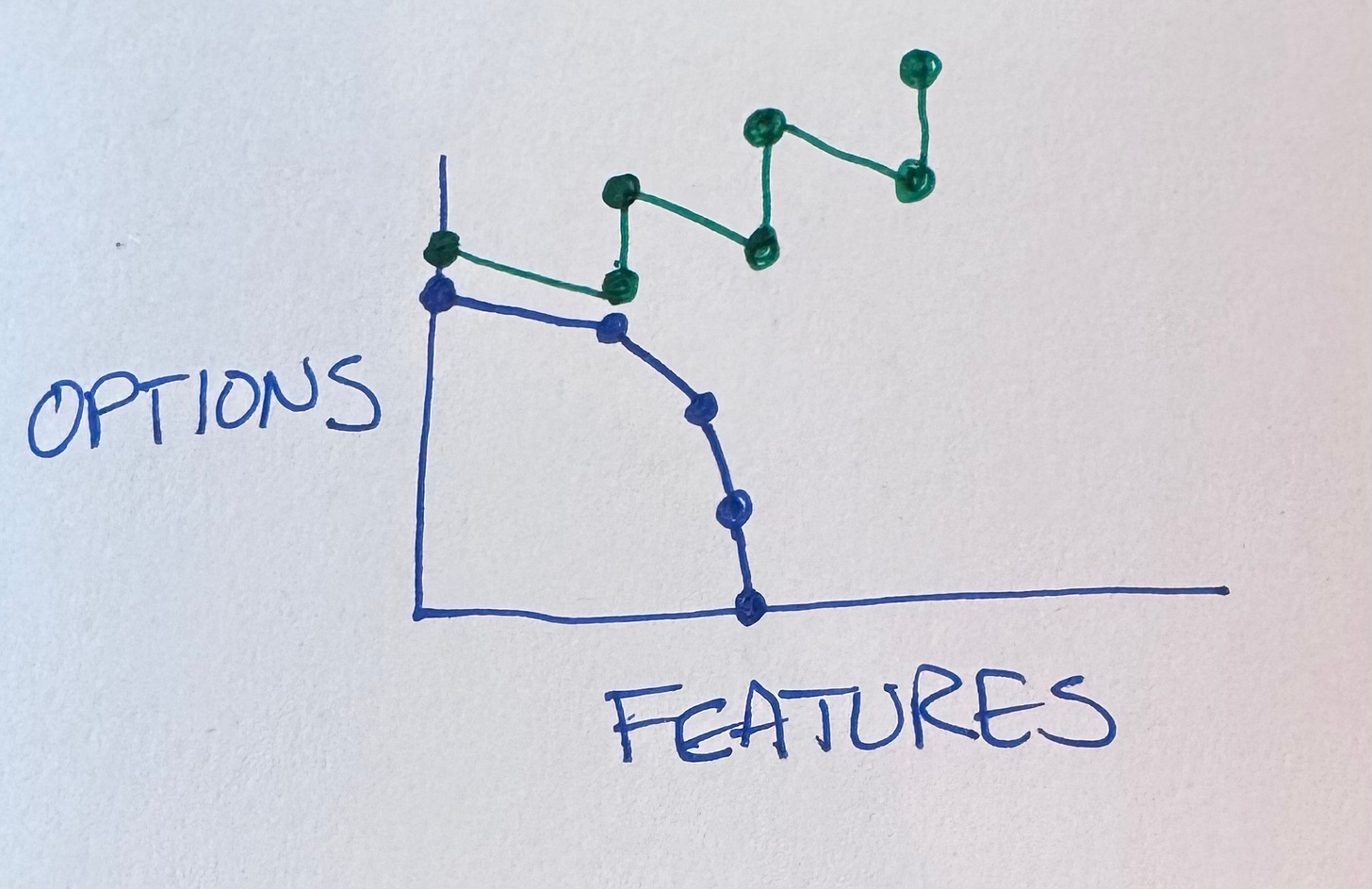
Thank you for your thoughtful and valuable insights! One question struck me: on your last chart, how can we end up with more options than we had on the green field?
I mean, I would have expected that tidying allows us to recover parts of our "lost options", to get a bit upward along the y-axis, a bit closer towards the level we had in the beginning. But getting above that, how's that possible?
It seems to be a nice article/post, but I don't got the "options" meaning