It’s not for me to discourage this kind of generosity.
However, being of a too-literal cast of mind, I’m going to well-actually this comment because I think there’s a deeper point beneath it. But first, thanks Manoj Bharadwaj!
Thanks to today’s sponsor Unblocked.
When I was a young programmer we were berated for not writing more documentation, but that documentation always turned out to be useless by the time we needed it. That experience was my impetus for writing about communicative code (Smalltalk Best Practice Patterns & Implementation Patterns).
Unblocked meets the same need in the same moment--I have to change this code but what is going on? Unblocked answers this question with less effort on the part of the original programmer & the answers are always up-to-date.
Illustration
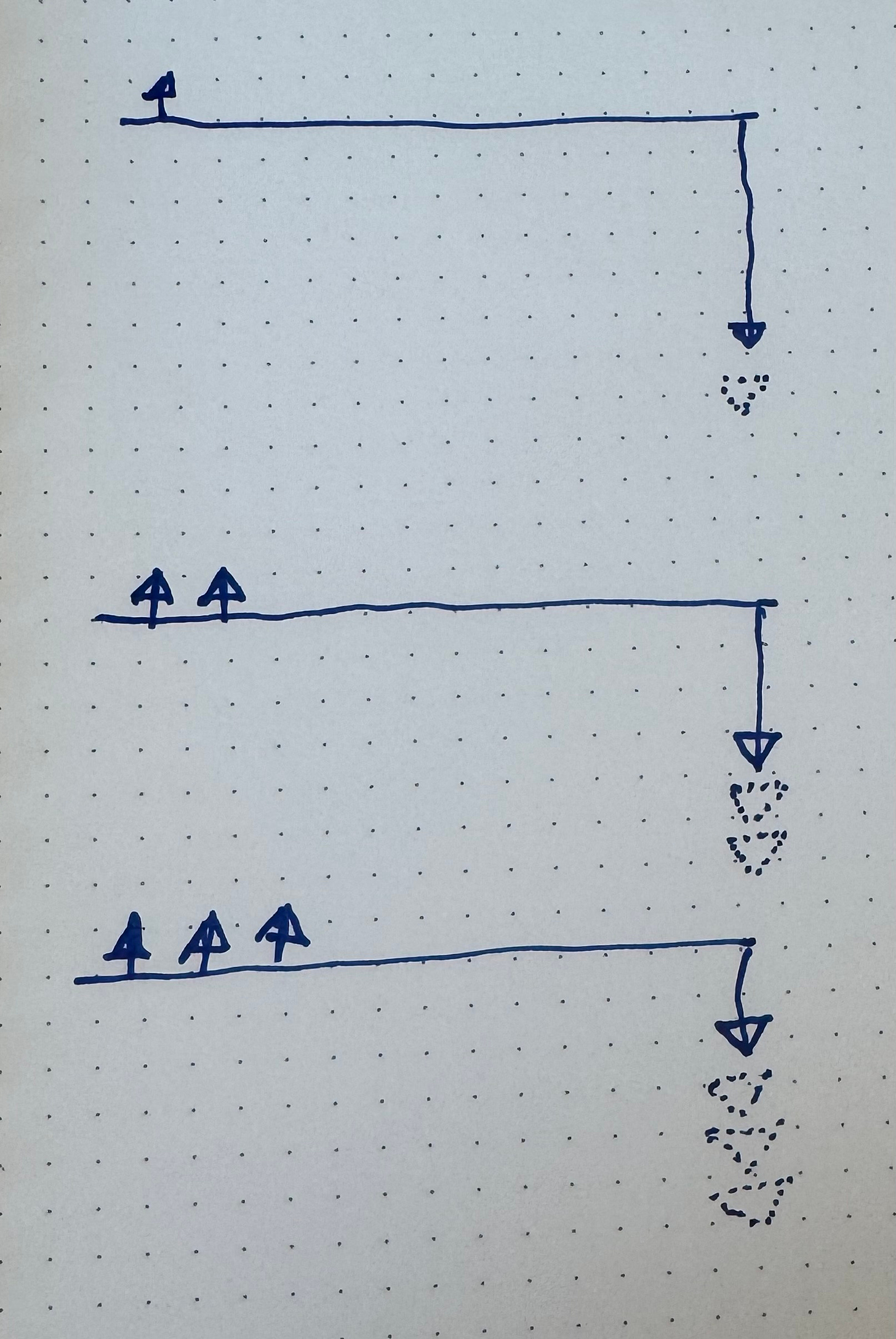
The comment was in response to this illustration.
I wanted to help readers develop an intuition for why small, incremental releases were valuable. Even if each release doesn’t create much positive value (& that’s a big if), each release creates value by decreasing the potential loss if a big release goes badly.
Some people got it:
Others didn’t:
Which is a good reminder to let other people own their reactions & for me to only own how carefully I communicate.
But that wasn’t the point I wanted to make.
Workflow & Activation Energy
When I’m explaining an idea I tend to include visuals as part of my explanation. Sometimes the visualization comes first & the words support it. Sometimes I’m in the middle of a paragraph when a visual comes to me. What are my options when an illustration pops into my head?
Open up a drawing program. Switch my brain to “drawing program” mode. Try to optimize my actions to achieve the desired visual. Speculate on the code implementing those actions (I’ve written & used drawing programs for 40 years). Critique the UI for too-long click paths. Begin designing an alternate UI. Consider starting a new open source drawing program. Where the hell was I?
Knowing myself, consider the likelihood of #1 & give up on the illustration.
Grab an index card & a pen (always right there). Draw. Snap a picture with my phone (also always right there). Crop. Copy. Hope Apple’s cross-machine copy & paste is choosing today to work. Paste. Done & back to writing.
In short, I hand-draw because it makes me more likely to illustrate. & more likely to write.
Consequences
These illustrations have become part of my brand, part of my signature. If you see ink on dotted paper, you know I actually picked up a pen & drew for you. Some people get it & some people don’t (see above).
Some people are turned off by the lack of perfection in the illustrations (I’ve fielded this complaints many times). They see the rough nature of my illustrations as a sign of lack of commitment or polish or skill on my part. That’s okay. I spent 40 or 50 years coming up with these opinions. Ten minutes more or less isn’t going to change their value. If you decide that those 10 minutes are the difference between it being worth paying attention to what I say & not paying attention, you’re fully entitled to that opinion. On my side, I know I’ll write more & illustrate more if I work in this style.
The larger point I wanted to make is that you don’t just do your work, you design how you do your work. I call this Making Making. Pay attention. Experiment. You’re unique—find your unique style, but make sure it’s one that positively meshes with the people affected by that style.


These comments remind me of you championing 3X5 cards for CRC work and user stories. Keep to a low tech approach to maintain a low barrier to idea flow and capture. Efforts to polish the presentation are better used to polish the idea.
Personally I love the hand drawn diagrams. They have personality! Reminds me of reading Vonnegut.